Creating Hub3’s logo with the Golden Ratio
Jun 13, 2021
Logo Goals
I wanted Hub3’s logo to encapsulate what Hub3 stands for: a hub for strategy, design, and code. Those four concepts (including the hub) need their own distinct components in the logo.
The logo also needs to look great in various contexts: our website, LinkedIn, invoices, etc. After a quick survey of those contexts, I decided that our logo needs to scale well at small sizes and is perfectly centered when framed in a circle or square (think Facebook vs. LinkedIn profile images).
Lastly, I wanted the logo to be vector-based (instead of pixel-based) to be resizable without quality loss. It should also be built with simple primitives (circles, rectangles, etc.) so that it’s easily reproducible. I picked Sketch as my design tool because I’m most familiar with it.
Problem: Never-ending Iteration
Before jumping into the logo’s construction, I’ll describe the design process I used and the pain points it addresses.
Given the subjectivity of design and all the options for colors and shapes, I find it hard to settle on any design confidently. There always seems to be a tweaked variation that’s incrementally better—a brighter blue, larger corner radius, etc. As a result, I’ve spent way too much time chasing incremental design improvements, feeling unsatisfied.
For example, here are some questions that cause me to spin my wheels:
- How big should this circle be?
- What’s the perfect shade of red?
- How much padding should be between a logo and its frame?
- How curved should this edge be?
To answer those questions, I want to trust in a process that doesn’t rely entirely on my gut or the opinions of others.
Solution: Constraints
How do I design faster with more confidence? For me, it’s simplifying my design process and adding constraints that prevent me from chasing incremental gains.
Here are the constraints I came up with for the Hub3 logo project:
- Colors can only be picked from a popular color catalog (e.g. colors.lol).
- The logo can only be built with primitive shapes: circles, triangles, and rectangles.
- The Golden Ratio should be used to define the initial sizes of primitives.
That’s my sandbox! Let’s dive into the last constraint, which this post focuses on.
Golden Ratio
For our purposes, the Golden Ratio (or “divine proportion”) is a ratio between two lengths that produce proportions considered aesthetically pleasing. It appears in natural and man-made contexts like architecture and financial markets. Specifically, it’s an irrational number represented by \(\phi\) and commonly truncated to 1.618.
Here’s the Golden Ratio in action, for segments \(\overline{\rm AC}\) and \(\overline{\rm CB}\):

Interestingly, the Golden Ratio is hidden in the Fibonacci Sequence. Consider a segment of the Fibonacci Sequence below:
0, 1, 1, 2, 3, 5, 8, 13, 21, 34, 55, 89, 144, ...As you progress through the sequence and divide each number by the previous, you get closer and closer to the Golden Ratio. For example:
\[ 2 \div 1 = 2 \\ 8 \div 5 = 1.6 \\ 34 \div 21 \approx 1.619... \\ 144 \div 89 \approx ~1.618 \]
Cool! Now we know what the Golden Ratio is and how to approximate it. Let’s put it to use.
Logo Construction
Jumping ahead, I know we’ll need to start with a bunch of circles. How big should the circles be? Let’s use the Golden Ratio!
First, pick an initial circle size—I picked 300px. Create the next circle by multiplying the first circle’s diameter by the Golden Ratio, or 1.6 (you could use 1.618, but that results in more non-integer products). Repeat this three more times until you have five overlapping circles:

Easy! The big idea is that we can now trust that these “divine proportions” will care over into the derived logo.
How should we represent the “hub” in Hub3? The Webster dictionary defines a hub as “a center of activity” or “the central part of a circular object.” I think a circle works, and I picked the first one. We’ll also want some padding around it, so I’ll keep the next immediate circle.

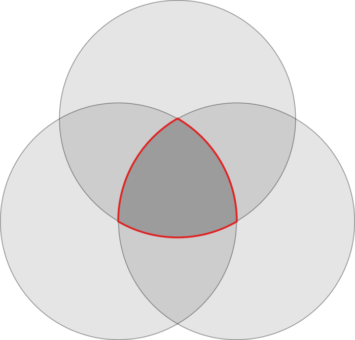
Next, how to represent the “3” in Hub3? I think of the intersection of strategy, design, and code as a digital product—they all contribute in their own way. I imagine a Venn diagram with three circles that overlap:

I like the shape created when the circles overlap (outlined in red). It’s a triangle shape and built with three overlapping circles—awesome.
How do we decide how big the overlapping circles should be? Further, how much should they overlap? To answer those questions quickly, I duplicated the center circle three times (in blue) and rotated them all 120 degrees from each other. I then took the outer-most circle (in green) and moved it up until its edge touched the bottom blue circles.

Next, to create the remaining two overlapping circles, we duplicate the green circle twice and rotate the duplicates 120 degrees around the center, as we did for the blue circles.

It’s coming together. Note that we haven’t created any new shapes—just clones of existing ones at their original sizes.
Let’s simplify our workspace and “intersect” the green circles and subtract the inner circle’s padding to get the logo’s outline.

We now have a circle and a triangle shape. How are we going to represent strategy, design, and code? I decided to divide the triangle shape into three “leafs” surrounding the hub (center circle). To do that, I created a rectangle with the width of the inner circle’s padding and rotated its duplicates around the center.

I then “subtracted” the newly created rectangles (in blue) from the original shape, which results in three new shapes that surround the hub.

To add a sense of movement to the logo, I decided to accent each of the “leafs” by adding a corner radius to the inner left corner. I then applied Hub3’s branding colors to bring the logo to life.

Finally, we need to center the logo in a container for social media. How wide should the logo be relative to the frame? You guessed it—the ratio between the frame’s width and the logo is 1.6:

Final Thoughts
In the end, the Hub3 logo was created almost entirely by cloning circles made via the Golden Ratio and applying boolean operations. Via the constraints I outlined above, I moved faster and deliberated less. As they say, sometimes less is more.
What’s so special about the Golden Ratio? Unfortunately, I don’t know. It was a helpful design heuristic for this project that I’ll likely apply with a grain of salt to future projects. Here are rough alternative logos that don’t use the Golden Ratio—I’ll let you decide if the Golden Ratio helped:

Interestingly, Spotify found that the Golden Ratio didn’t help their logo:
Gizmodo: What’s the deal with those waves or squiggles or whatever they are? In the redesign they’ve been moved off to the left.
CW: We noticed that people have been complaining on the Interwebs about them not being perfect. We had tried out the golden ratio on them but that made it look even more weird. This version is a little more organic and it’s not super perfect, which I think gives it more personality.
